UX/UI DESIGN + BRANDING
Zeit
Time Travel for the 21st Century

Client
Zeit
Role
Lead UX + UI designer (Research, Interaction Design, Visual Design)
Timeline
80 hours over 4 weeks
The human race has been dreaming about time travel for ages. Now it’s finally possible! Truly, these are exciting times to live in!
Background
Just last month, the International Concordance on Time Travel announced standards which allow the experience of time travel to be accessible by everyone.
Zeit, a subsidiary of Richard Branson’s Virgin empire, will paved the way for this decade-old technology by making its debut on the international scene. Nearly 300 locations, ranging from prehistoric times to today, are ready to host travelers.
Problem
Zeit needs help to establish their presence in the travel industry by creating a brand, as well as a responsive e-commerce site in which they can sell travel packages to different places in times.
Outcome
Zeit's new brand and e-commerce website not only allows users to book one-of-a-kind experiences, it builds trust by educating and informing users in a clear way.
Empathize
Understand the user through observation, engagement, and immersion.
techniques
Secondary Research
Primary Research
Secondary Research
I conducted initial market research to gain a better sense of the field of travel tourism—recording what I already knew, figuring out the things I didn't, and looking specifically at competitors and their audiences. Because Zeit's offering is the first of its kind, there was no existing time travel industry from which to pull data. Instead, I chose to focus my research on the travel industry at large, conducting a quick survey to better acquaint myself with trends the user habits.
Insights
Adventure-based tourism is one of the fastest growing subgroups of the travel industry
Travel companies trying to differentiate themselves with their perks to appeal to a specific audience (ex. luxury accommodations, loyalty programs, expert guided tours, environmentally conscious travel)
Word-of-mouth is big—95% of users report that they consult user-ratings when planning a trip
There is a tendency to discredit and pigeon-hole both millennial and baby-boomer travelers, when, in fact, these groups has increased spending and time spent traveling compared to previous years
Next, through competitive analysis, I researched how others in the field solving a similar problem. I identified both companies specializing in curated, package-based travel (indirect competitors), and companies specializing in one-of-a-kind travel experiences (other competitors). For each, I analyzed strengths and weaknesses of messaging, offerings, and web presence.
I also created a few provisional personas to form a broad idea of what Zeit's audience might look like.
View Market Research and Competitive Analysis here.
Primary Research
With a better understanding of the travel industry, I went in-depth with potential users to gather qualitative data on their needs, wants, pain points, and behaviors. I conducted 1-on-1 user interviews with five participants aged 22-57. An interview script was developed that focused user preferences, experiences, and motivations for traveling, with an emphasis on planning and book travel. But more specifically, I wanted to gather feedback on the following:
Determine users experience, good and bad, booking travel on existing sites
Identify pain points in the current online travel booking experience
Determine the process, or order, in which users book travel (search by date, browse, choose location, etc.)
Determine which trips, time periods, activities, and locations interests users the most
View Interview Script here.
After interviews concluded, I summarized findings based on patterns and categorized them into Needs, Wants, and Desires.
View Interview Debrief here.
Define
Techniques
Empathy Map
User Persona
Project Goals
Feature Roadmap
Synthesize research into compelling needs and insights.
Empathy Map
With the feedback gathered during user interviews, an empathy map was created in order to understand the users, organize my research, and keep a human-centered view of the product. I transcribed all observations and statements, then paired together repetitive information, identifying themes and patterns.
Insights were identified based on the groupings, then needs were tailored to those insights.
Insights
Users desire unrestricted itineraries when traveling.
Users want to feel in control of their trip.
Users make travel decisions based on cost.
Users prefer to travel with family and friends.
Users have a variety of trip styles.
Needs
Users need the freedom to choose how they will spend their days.
Users need the ability to tailor their travel options.
Users need to feel like the price matches the product.
Users need the ability to add on travelers of all ages to their trip.
Users need to be able to locate trips that are interesting to them.
View full Empathy Map here.
User Persona
Based on gathered research, combined with empathy map realizations, I created a fictional but realistic representation of my key audience segment.
project goals
In an effort to cover all my bases, I combined business goals from the design brief and user goals from my empathy research, taking into account technical considerations, to identify necessary features to include on the website.
feature roadmap
With project goals realized, a feature roadmap was then created to rank website features by priority based on development and returns on investment.
View Features Roadmap here.
Ideate
Generate ideas for potential solutions to the problem.
Techniques
Card Sorting
Sitemap
Task + User Flows
UI Requirements
card sorting
In order to create successful information architecture for Zeit, I ran an open card sorting exercise to gain insights on how users naturally organize content. Six participants were asked to sort 30 cards into groups of their choosing. A combination of online and in-person card sorts were conducted, each providing their own benefits. While the online format was able to reach more participants, the in-person format allowed me to observe and interact with participants as they worked.
Summary
Categories such as location (or places) and time period (or eras) would be a solid starting point for building filters because iterations of each appeared the most often.
More specific tags (such as people, architecture, arts, pop culture) will allow users to further pare down results in order to reach more specific offerings.
SITEMAP
Building from the product goals, feature roadmap, and card sorting results, I created a sitemap that included proposed pages to help visualize how the site would be organized, with the goal of creating the most concise structure possible.
Task + user flows
With the sitemap drawn out, I moved on to the beginning stages of prototyping. Simulating the flow a user follows to achieve a key task on the website, I was able to outline the screens that need to be created.
See Task Flow here.
Going into even more detail, I created a user flow that shows how three users with different scenarios could complete various tasks. This process ensures we account for all screen users will need in order to complete tasks.
From these flows, combined with my features roadmap, I created a UI requirements document that detailed pages and elements essential for a user to complete a part of their booking task flow: from homepage, to search results, to trip detail page. This document served as a checklist as I began prototyping.
View UI Requirements here.
Prototype
Techniques
Wireframing
Brand Identity
Responsive User Interface
UI Kit
Prototyping
Research and build working examples of ideas.
wireframing
Before going digital, I sketched out three homepage layouts which were based on research, goals, and requirements. The “sketch first, digital later” is a less overwhelming approach to tackling design and allowed me to brainstorm multiple visual directions before committing to one.
Wireframes created in Sketch served as a blueprint for Zeit's interface. They allowed me to visualize hierarchy, priority, and flow before implementing more minute details, such as font and colors.
Desktop Wireframes
My first set of low-fidelity wireframes represented three key screens of the booking experience—homepage, search results page, and trip detail page.
Responsive Wireframes
I then created responsive wireframes to account for the different devices a user may use to access the website—desktop, tablet, and mobile. These homepage responsive wireframes set the tone for the other responsive layouts designs for key screens, which came later.
prototyping
InVision was used to create an interactive prototype of my desktop wireframes.
This prototype is currently archived. Please contact me for access.
Brand Identity
Building Zeit's visual identity began by defining brand attributes, which were outlined in the project brief:
Modern—Fresh—Classical—Historical
I then collected visual inspiration, using Pinterest to create a mood board.
View Mood Board here.
Logo
How could I simply depict the complicated idea of time travel? I first sketched out loose ideas, combining various themes of travel, history, and the past. I tried to steer clear of obvious time travel imagery, because I was finding that my iterations automatically looked dated.
Keeping in mind competitor brands, and Zeit's positioning as "first of its kind", my digital concepts explored movement through time and space.
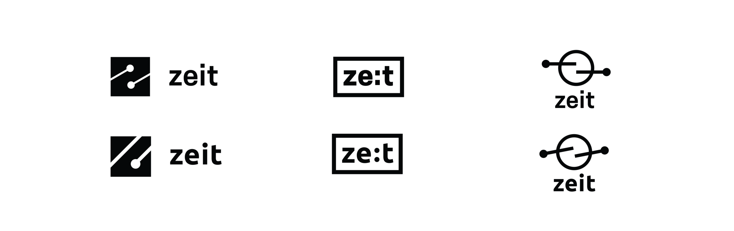
The final iteration of the logo represents all of the brand attributes, and I was able to sneak a little 'Z' in there.
Style Tile
Pulling inspiration from my mood board, I created a color palette, type treatment, and set a visual tone through imagery for the brand. This style tile served as the foundation of the site's interface design.
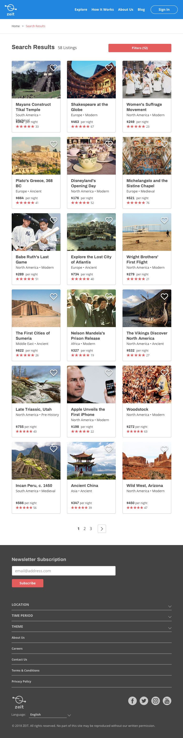
Responsive User Interface
A responsive UI design was created by merging our responsive wireframes and our style tile.


UI Kit
With my responsive wireframes in place, I created a UI Kit for Zeit website to serve as a working elemental, pattern, and branding cheat sheet. This kit will be updated as the brand is built further, and features are adopted or changed.

Test
Refine and improve solutions.
Techniques:
Usability Testing
Affinity Map
Priority Revisions
Handoff
Usability testing
Before conducting usability testing, I first outlined objectives, methodologies, information about participants, and brainstormed tasks. This served as a rubric during testing sessions.
View Usability Test Plan here.
Five participants were asked to complete a series of six tasks across three scenarios. It was important to me to conduct my usability testing in-person so I could observe not only verbal cues, but behavioral cues a well. I made notes as each user navigated the site.
After conducting usability testing, I compiled a document that outlined the overall summary of our testing and feedback I received.
View Usability Test Findings here.
Affinity map
Usability testing feedback was gathered and organized into various categories (successes, problems, and observations). An affinity map output insights and recommendations, which served as a guideline to create the next iteration of the website. Recommendations were prioritized high to low, with any time or budget constraints also considered.
View full Affinity Map here.
Priority Revisions
After gaining insight from test subjects and prioritizing recommendations, I tweaked my high-fidelity mockups and prototype.
Handoff
The final step was to ready my design for developers, making sure they have all the necessary documentation to build the site successfully. I used Zeplin, a popular spec tool which easily generates CSS and style guides. This brought to light some small inconsistencies that I was able to revise before handoff.

Post-Mortem
Project Takeaways
Research is so important. My research phase got off to a bit of a rocky start. I was so overwhelmed with the task of creating a website for a new product (and a fictional one, at that), that I focused on loose goals thinking that a greater quantity of surface-level research would provide me with a clearer direction. But instead, feedback I received from users was somewhat vague, and left me with little direction. Luckily, because there is a strong travel industry to pull inspiration from, I was able to get back on track. Next go-round, focusing my research will be my biggest goal.
Comfort appeals to users. Building a structure for Zeit that was similar to other travel industry websites was expected from users. Research showed that users revisit sites their comfortable with, just because it’s easier. When design deviated from common design patterns, users became lost or frustrated during testing.
Call it what it is. Users were misled by my attempts at flowery language and trip titles. With the product that Zeit offers, there’s really know room for users to be confused. This is time travel, it’s that simple. Their attention is better focused more on building trust in the company, so they buy the product.
Next Steps
There are many more pages to build. I only focused on key screen here, but with more time, I'd like to build out the checkout flow, Explore pages, and user account features.
Throughout the project, I pulled visual influences from other time travel websites. I'd like to explore more layout options for Zeit's cards to give them a more unique feel that is all their own.